My personal favorite is the circular text surrounding the warrior. But for the most part, I tried to keep it overly simple in the hopes that my incredibly bland button designs would be chosen, since nobody ever picks the interesting ones.
Wednesday, November 9, 2011
Tuesday, November 8, 2011
Assignment
I love this design. It's such a simple concept and it has such elegant execution. You can see the effort put into it; the 3D is incredible. The typography is very well done, with the words begin part of the roots. This ad is bright and very well executed. It conveys the ides that your business will flourish with the proper water, or something along those lines.
Monday, October 31, 2011
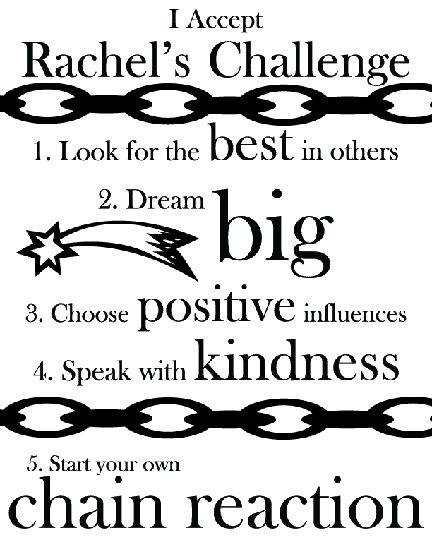
Rachel's Challenge Again
Now it's entirely black and white. And I tried to make it more interesting given what I have to work with. Now ask if I care.
Thursday, October 27, 2011
Poster for Rachel's Challenge
So, yeah, here it is. I'm satisfied with it; it seems schmaltzy enough.
Say what you think of it, Mrs. Ottum, and I'll take it under consideration.
Tuesday, October 4, 2011
More posters
Okay, so I've narrowed my submissions to Foren down to these:
Foren can pick which he likes. Feel free to want a different color scheme.
Subscribe to:
Posts (Atom)